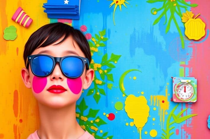
Color is one of the most powerful tools in art—it transcends language, culture, and time. The psychology of color in art explores how hues, tones, and shades affect our emotions, thoughts, and behaviors. From the deep blues of Picasso’s Blue Period to the bold reds in digital advertising, color communicates in ways words cannot. Artists, designers, and digital creators harness color to evoke specific responses, shape perception, and enhance meaning.
This article dives deep into how color psychology functions in different art forms, including traditional painting, graphic design, and digital media. We will also explore how artists and designers can use color strategically to enhance creativity and emotional resonance.
Understanding the Psychology of Color
Color psychology is the study of how colors influence human behavior and emotion. It examines the way colors trigger psychological responses—both conscious and subconscious. While individual reactions can vary due to culture, personal experiences, and context, certain colors consistently evoke particular feelings across societies.
For example, red often symbolizes passion, energy, or danger, while blue represents calmness, stability, and trust. These associations are deeply rooted in evolutionary biology and social conditioning. For artists, understanding these connections allows for more intentional and impactful use of color.
Science Behind Color Perception
Color perception is not merely a visual process—it’s a complex interaction between light, the human eye, and the brain. When light hits an object, certain wavelengths are absorbed while others are reflected. The reflected wavelengths determine the color we perceive. Our brains then interpret these wavelengths and attach meaning to them, influenced by memory, emotion, and cultural symbolism.
Artists intuitively exploit this process. By manipulating light and pigment, they create emotional landscapes that speak directly to the subconscious.
Emotional Impact of Color in Art
Warm Colors: Energy and Passion
Warm colors—red, orange, and yellow—are often associated with energy, warmth, and excitement. They advance toward the viewer, creating a sense of closeness or urgency.
- Red: Often linked to love, power, and aggression. In art, red can symbolize life and vitality or danger and anger. For instance, Henri Matisse used red to express emotional intensity and warmth.
- Orange: Conveys enthusiasm, creativity, and playfulness. It stimulates mental activity and is often used to grab attention.
- Yellow: Represents optimism, joy, and enlightenment. However, when overused, it can evoke anxiety or frustration.
These colors stimulate both the mind and body, making them powerful in evoking visceral responses.
Cool Colors: Calmness and Reflection
Cool colors—blue, green, and purple—are calming and relaxing. They tend to recede in space, creating an illusion of depth and tranquility.
- Blue: Symbolizes peace, trust, and introspection. Picasso’s Blue Period famously used monochromatic blues to depict melancholy and contemplation.
- Green: Represents nature, growth, and renewal. It brings balance and harmony, often used in landscape paintings to soothe the viewer.
- Purple: Combines the stability of blue and the energy of red, symbolizing mystery, spirituality, and luxury.
Cool tones often create a meditative or reflective atmosphere, ideal for artworks that invite contemplation.
Neutral Colors: Balance and Sophistication
Neutrals such as black, white, gray, and brown provide grounding and contrast. They can either dominate or support other hues.
- Black: Evokes elegance, mystery, and power. In modern art, it often represents emptiness or the unknown.
- White: Symbolizes purity, light, and simplicity. It’s used to create contrast and space.
- Gray: Conveys neutrality, sophistication, and ambiguity.
- Brown: Earthy and stable, it provides warmth and realism.
Neutral colors are essential in composition, as they allow vibrant colors to stand out and give the eye a place to rest.
Color Symbolism Across Cultures
Color meanings are not universal—they shift across cultures and historical periods.
- Red: In Western culture, it symbolizes love or danger; in China, it represents luck and celebration.
- White: Seen as purity in the West, but in parts of Asia, it signifies mourning.
- Black: Commonly associated with death and elegance in the West, but in African cultures, it can represent maturity and power.
- Yellow: A joyful color in Western art, but in some cultures, it denotes jealousy or deceit.
Artists working in global or cross-cultural contexts must navigate these nuances carefully. What evokes joy in one culture might trigger discomfort in another.
Cognitive Effects of Color
Memory and Attention
Color enhances memory retention and attention span. Studies show that information presented in color is up to 80% more memorable than monochrome data. In art, vivid color contrast can guide the viewer’s eye, emphasizing focal points and enhancing storytelling.
Creativity and Productivity
Certain colors can stimulate creativity. For instance, blue encourages abstract thinking, while red improves attention to detail. Artists often use color to enter specific mental states—bright palettes for inspiration, cool tones for focus.
Visual Illusions and Perception
Artists manipulate color relationships to create visual effects. The phenomenon of simultaneous contrast—where colors appear different depending on surrounding hues—was exploited by painters like Josef Albers. Understanding such effects helps artists control depth, movement, and emotional rhythm within compositions.
Color Trends and Cultural Evolution
Color preferences evolve with societal changes. For example:
- The 1970s favored earthy tones reflecting environmental awareness.
- The 1990s embraced neon colors representing modernity and technology.
- Today, pastel and muted palettes dominate design, symbolizing calmness in an overstimulated world.
Digital media has globalized color trends, creating new hybrid aesthetics. The emotional power of color continues to adapt to contemporary values—sustainability, inclusivity, and mindfulness.
Future of Color Psychology in Art
As technology evolves, so does the psychology of color. Virtual reality, augmented reality, and AI-generated art open new frontiers for immersive color experiences. Artists and designers can now analyze viewer responses through biometric feedback, refining how color impacts emotion and cognition in real time.
Neuroscience is also expanding our understanding of how color influences mood regulation, creativity, and even mental health. Art therapy increasingly uses color exercises to alleviate anxiety and depression, reinforcing color’s therapeutic power.
Conclusion
The psychology of color in art is more than aesthetic—it’s emotional, cognitive, and cultural. Colors are not just pigments or pixels; they are psychological instruments that shape how we feel, think, and connect. From the meditative blues of Rothko to the vibrant energy of digital design, color remains a universal language of emotion and meaning.
Whether you’re a painter, designer, or digital creator, understanding color psychology allows you to craft deeper, more resonant work. The next time you choose a color palette, remember—you’re not just selecting shades; you’re sculpting human emotion.